Thursday 8 September 2016

Pure CSS navigation menu in Ribbon style for blogger 2015

Pure CSS navigation menu in Ribbon style for blogger 2015


looking for css navigation menu?Here is the new navigation menu with created pure CSS in ribbon style.
While working in menus previously I have created radial menu and responsive menu. And this time I have created a brand new pure CSS navigation menu in ribbon style.

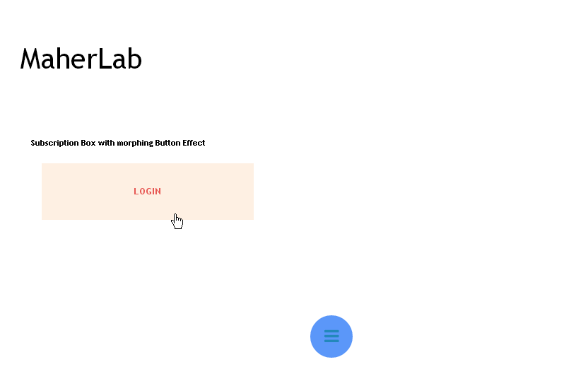
Also see: Subcribe Box with Pure CSS Social Buttons

This menu will not effect your site load time because the menu is created with pure css and no javascript or jquery used in it.
CSS navigation menu in Ribbon style


This is very simple and easily customizable menu which can be fit on any template.

Here is the demo of it:
Demo

Like this widget, let's see how to add it on your blog.

Add It on Blogger


  1. First go to Blogger dashboard >> Template tab
  2. backup your template
  3. click on Edit HTML
  4. Search for  ]]></b:skin> tag 
  5. Just above the ]]></b:skin> tag  paste the below code
 #navigation_container {
margin: 0 auto;
width: 900px;
}
#navigation li {
list-style: none;
display: block;
float: left;
margin: 1em 0.8em;
}
#navigation li a {
text-shadow: 0 2px 1px rgba(0,0,0,0.5);
display: block;
text-decoration: none;
color: #f0f0f0;
font-size: 1.6em;
margin: 0;
line-height: 28px;
}
#navigation li.active a:hover,
#navigation li a:hover {
margin-top: 2px;
}
#navigation li.active {
font-style: italic;
}
#navigation li.active a {
}
.rectangle {
background: #e5592e;
height: 62px;
position: relative;
-moz-box-shadow: 0px 0px 4px rgba(0,0,0,0.55);
-webkit-box-shadow: 0px 0px 4px rgba(0,0,0,0.55);
box-shadow: 0px 0px 4px rgba(0,0,0,0.55);
-webkit-border-radius: 2px;
-moz-border-radius: 2px;
border-radius: 2px;
z-index: 500; /* the stack order: foreground */
margin: 3em 0;
}
.l-triangle-top {
border-color: #d9542b transparent transparent;
border-style:solid;
border-width:50px;
height:0px;
width:0px;
position: relative;
float: left;
top: 1px;
left: -50px;
}
.l-triangle-bottom {
border-color: transparent transparent #d9542b;
border-style:solid;
border-width:50px;
height:0px;
width:0px;
position: relative;
float: left;
top: -40px;
left: -150px;
}
.r-triangle-top {
border-color: #d9542b transparent transparent;
border-style:solid;
border-width:50px;
height:0px;
width:0px;
position: relative;
float: right;
right: -45px;
top: -107px;
}
.r-triangle-bottom {
border-color: transparent transparent #d9542b;
border-style:solid;
border-width:50px;
height:0px;
width:0px;
position: relative;
float: right;
top: -149px;
right: -145px;
}


  • Now paste the below code where you want your menu appears. ( mostly at header section).

 <!-- container for positioning the banner --> <link href="//maxcdn.bootstrapcdn.com/font-awesome/4.2.0/css/font-awesome.min.css" rel="stylesheet"/> <div id="navigation_container">
<!-- the left side of the fork effect -->    <div class="l-triangle-top"></div>    <div class="l-triangle-bottom"></div> <!-- the ribbon body -->    <div class="rectangle"> <!-- the navigation links -->    <ul id="navigation">         <li><a href="#"><i class="fa fa-home">Home</i> </a></li>         <li><a href="#"> <i class="fa fa-book">About</i></a></li>         <li><a href="#"> <i class="fa fa-cogs">Services</i></a></li>       <li><a href="#"><i class="fa fa-at"> Contact</i></a></li>       </ul> < <!-- end the ribbon body -->    </div> <!-- the right side of the fork effect -->    <div class="r-triangle-top"></div>    <div class="r-triangle-bottom"></div> <!-- end container --> </div>
  • To add more options in menu add the below code just above the </ul>


 <li><a href="your link"><i class="fa fa-at"> Your text</i></a></li>

Credits

You are most welcome to share this widget with your own readers but you have to give proper credits to PakMax blog by attaching a link back to this post.

Also see: New Best Free Blogger Templates with Awesome design

New Box Subscription with morphing button effect

New Box Subscription with morphing button effect

Here is the New Box Subscription with the new morphing button effect. This will help you to increase your readers.
Box Subscription
While working on subscription boxes previously we have createdsubscribe box with pure CSS buttons and today I have created a very useful and adds a new feature in the subscription box which is morphing button effect which I got from tympanus site. 

If you don't know what is morphing button effect then don't worry if you want to know about it then just go to this link and read it and also check the demo and I hope that you understand very well. :)

How it works

I get the morphing button effect from the above listed site and then convert that effect for blogger. Now with this widget you can only adds the Sign up button at the sidebar or at any other place where you want. And when any user click on the button then a box subscription appears coming from the button to the centre of the screen.
Recommended Posts:

  1. Flat drop down Responsive Navigation Menu
  2. 11 Excellent CSS image hover effects for blogs

To check the live demo of this widget go to below link:

Add it on Blogger

  1. Go to Blogger Dashboard
  2. click on template tab
  3. Backup your template
  4. then click on the Edit HTML
  5. Now search for the </head> tag and just above it paste the following code:
             
 <link rel="stylesheet" type="text/css" href="http://tympanus.net/Development/ButtonComponentMorph/css/normalize.css" />
<link rel="stylesheet" type="text/css" href="css/demo.css" />
<link rel="stylesheet" type="text/css" href="http://tympanus.net/Development/ButtonComponentMorph/css/component.css" />
<link rel="stylesheet" type="text/css" href="http://tympanus.net/Development/ButtonComponentMorph/css/content.css" />
<script src="http://tympanus.net/Development/ButtonComponentMorph/js/modernizr.custom.js"></script>
<script type="text/javascript">
var _gaq = _gaq || [];
_gaq.push(['_setAccount', 'UA-7243260-2']);
_gaq.push(['_trackPageview']);
(function() {
var ga = document.createElement('script'); ga.type = 'text/javascript'; ga.async = true;
ga.src = ('https:' == document.location.protocol ? 'https://ssl' : 'http://www') + '.google-analytics.com/ga.js';
var s = document.getElementsByTagName('script')[0]; s.parentNode.insertBefore(ga, s);
})();
</script>


  •  Now Again search for the </body> tag and just above it paste the following coding:

 <script src="http://tympanus.net/Development/ButtonComponentMorph/js/classie.js"></script>
<script src="http://tympanus.net/Development/ButtonComponentMorph/js/uiMorphingButton_fixed.js"></script>
<script>
(function() {
var docElem = window.document.documentElement, didScroll, scrollPosition;
// trick to prevent scrolling when opening/closing button
function noScrollFn() {
window.scrollTo( scrollPosition ? scrollPosition.x : 0, scrollPosition ? scrollPosition.y : 0 );
}
function noScroll() {
window.removeEventListener( 'scroll', scrollHandler );
window.addEventListener( 'scroll', noScrollFn );
}
function scrollFn() {
window.addEventListener( 'scroll', scrollHandler );
}
function canScroll() {
window.removeEventListener( 'scroll', noScrollFn );
scrollFn();
}
function scrollHandler() {
if( !didScroll ) {
didScroll = true;
setTimeout( function() { scrollPage(); }, 60 );
}
};
function scrollPage() {
scrollPosition = { x : window.pageXOffset || docElem.scrollLeft, y : window.pageYOffset || docElem.scrollTop };
didScroll = false;
};
scrollFn();
[].slice.call( document.querySelectorAll( '.morph-button' ) ).forEach( function( bttn ) {
new UIMorphingButton( bttn, {
closeEl : '.icon-close',
onBeforeOpen : function() {
// don't allow to scroll
noScroll();
},
onAfterOpen : function() {
// can scroll again
canScroll();
},
onBeforeClose : function() {
// don't allow to scroll
noScroll();
},
onAfterClose : function() {
// can scroll again
canScroll();
}
} );
} );
// for demo purposes only
[].slice.call( document.querySelectorAll( 'form button' ) ).forEach( function( bttn ) {
bttn.addEventListener( 'click', function( ev ) { ev.preventDefault(); } );
} );
})();
</script>


  • Well guys, now come to the final and important step. For this go to the Layout Taband Click on the Add Gadget and select HTML/Javascript where you want the button to be appeared.
  • Now in the Gadget add the following piece of coding:

 <style>
#boxheading
{
text-align: center;
font-size:30px;
}
.subscribe{width:100%;height:100px;}
.subscribe h3{color:#fff;margin-bottom:2px;font-weight:600;text-align: right;font-size:25px;color:black;}
.subscribe form{float:center;margin:28px}
.subscribe form .inptfld{font-family:Open Sans;outline:none;border:2px solid;border-color:grey;font-size:15px;padding:10px;border-radius:3px;width:250px}
.subscribe form {font-famiy:open sans;outline:none;border:none;padding:10px;border-radius:3px;color:#fff;cursor:pointer;margin-left:10px}
.subscribebtn{font-famiy:open sans;outline:none;border:none;padding:10px;border-radius:3px;color:#fff;cursor:pointer;margin-right:10px; position:relative; left:60px; bottom:-50px;font-weight:bold;float:center;width:150px;height:50px;}
.subscribe form .subscribebtn:hover{background:#2c3e50;-webkit-transition:all .3s ease 0;-moz-transition:all .3s ease 0;-ms-transition:all .3s ease 0;-o-transition:all .3s ease 0;transition:all .3s ease 0}#credits
{
font-size="8px;
text-align: right;
position:relative;
bottom:-50px;
left:190px;
}
</style>
<div class="mockup-content">
<div class="morph-button morph-button-modal morph-button-modal-2 morph-button-fixed">
<button type="button">Login</button>
<div class="morph-content">
<div>
<div class="content-style-form content-style-form-1">
<span class="icon icon-close">Close the dialog</span>
<div id="boxheading">
<h3>Sign up to get Free Updates</h3> </div> <div class="subscribe">  <form action="http://feedburner.google.com/fb/a/mailverify" method="post" onsubmit="window.open('http://feedburner.google.com/fb/a/mailverify?uri=pakmax', 'popupwindow', 'scrollbars=yes,width=550,height=520');return true" target="popupwindow">
<input class="inptfld" name="name" placeholder=" Your Name..." style="font-family:Open Sans" type="text"/>
<br />
<br />
<br />
<input class="inptfld" name="email" placeholder=" Your Email" style="font-family:Open Sans" type="text"/>
<input name="uri" type="hidden" value="pakmax"/>
<input name="loc" type="hidden" value="en_US"/>
<input class="subscribebtn" type="submit" value="Sign Up Now!"/>
</form><div id="credits">
Widget By<a href="http://www.pakmax.net/">PakMax</a>
</div>
</div> </div>
</div>
</div></div></div>

Further Customization 

  • Now replace http://feedburner.google.com/fb/a/mailverify?uri=pakmax with your Feedburner Email Feed link. You can get it by visiting your feedburner account then navigate to Publicize and then to Email Subscription.
  • Replace pakmax with your feed title. It appear at the end of your feed link. In my case it is http://feedburner.google.com/fb/a/mailverify?uri=pakmax

Credits

You are most welcome to share this widget to your own readers but you should have to give credits to PakMax blog by attaching link back to this post. Please do respect of others privacy and don't copy/paste others work because they can take hours of hardwork to create them and always give credits to the original man or organization who created the widget or anything.

You can also observe that I also in the start give credits to those from where I take the morphing effect and I don't feel hesitation in it because you are not doing anything wrong. :)

Final Words

I hope that you really like this new blogger widget and also like to use it on your own blog and this new widget may adds a new life to your site. :)
If you got any problem or any complication in the installation of the widget or if the widget is not working on your site then don't need to worry just comment here below and we s

Flat drop down Responsive Navigation Menu - blogger widget

Looking for responsive navigation menu? Here is the flat style responsive drop down navigation menu for your template.
Responsive Navigation Menu
Now adding responsiveness in template is become necessary and we have to make our template responsive in design. The reason tocreate responsive template is to providing flexibility and easiness to the mobile users.


We also have to make our navigation menus responsive because, they are extremely useful in providing a friendly and clean environment to your visitors and every good blogger always care his readers and try to provide a easy and clear environment to his readers.

Therefore, if you also wish to get responsive navigation menu for your site then your are at right spot because in this post I have created a brand new flat responsive navigation menu for blogger.

You can freely use this widget on your blog.
Let's see how you can install this responsive menu on your blog: ;)

Recommended Topics:

  1. Subcribe Box with Pure CSS Social Buttons
  2. 14 Best Free css scrollbar style for blogger
  3. Add Complication Box blogger widget to your blog New!
  4. Best Tools and Resources required for blogger template designer

Add it on blogger

  1. Goto blogger dashboard >> Template 
  2. Back up your template
  3. Edit HTML
  4. At there search for the ]]></b:skin> tag and just above it paste the following code:
 /*--------Resposive menu by PakMax.net----------------*/
#nav-trigger {
    display: none;
    text-align: center;
}
#nav-trigger span {
    display: block;
    background-color: #5b97f9;
    cursor: pointer;
    text-transform: uppercase;
    padding: 0 25px;
    color: white;
    font-weight:bold;
    line-height: 67px;
}
nav#nav-mobile {
    margin: 0px;
}
#pmflatnav a {color:#ecf0f1;}
#pmflatnav ul {
  text-align: left;
  display: inline;
  margin: 0;
  padding: 15px 4px 17px 0;
  list-style: none;
  -webkit-box-shadow: 0 0 5px rgba(0, 0, 0, 0.15);
  -moz-box-shadow: 0 0 5px rgba(0, 0, 0, 0.15);
  box-shadow: 0 0 5px rgba(0, 0, 0, 0.15);
}
#pmflatnav ul li {

  font: bold 12px/18px sans-serif;
    border-top:2px solid;
    border-right:1px dotted;
  display: inline-block;
  margin-right: -4px;
  position: relative;
  padding: 15px 20px;
  background: #5b97f9;
  cursor: pointer;
  -webkit-transition: all 0.5s;
  -moz-transition: all 0.5s;
  -ms-transition: all 0.5s;
  -o-transition: all 0.5s;
  transition: all 0.5s;
}
#pmflatnav ul li:hover {
  background: #34495e;
  color: #fff;
}
#pmflatnav ul li ul {
  padding: 0;
  position: absolute;
  top: 48px;
  left: 0;
  width: 150px;
  -webkit-box-shadow: none;
  -moz-box-shadow: none;
  box-shadow: none;
  display: none;
  opacity: 0;
  visibility: hidden;
  -webkit-transiton: opacity 0.2s;
  -moz-transition: opacity 0.2s;
  -ms-transition: opacity 0.2s;
  -o-transition: opacity 0.2s;
  -transition: opacity 0.2s;
}
#pmflatnav ul li ul li {
  background: #5b97f9;
  display: block;
  color: black;

}
#pmflatnav ul li ul li:hover { background: #34495e; }
#pmflatnav ul li:hover ul {
  display: block;
  opacity: 1;
  visibility: visible;
}
nav#nav-mobile {
    position: relative;
    display: none;
}
nav#nav-mobile ul {
    display: none;
    list-style-type: none;
    position: absolute;
    left: 0;
    right: 0;
    margin-left: auto;
    margin-right: auto;
    text-align: center;
    background-color: #ddf0f9;
    z-index: 10;
    padding: 0px;
    border-bottom: solid 1px #cc0028;
}
nav#nav-mobile li:last-child {
border-bottom: none;
}
nav#nav-mobile a {
display: block;
color: #29a7e1;
padding: 10px 30px;
text-decoration: none;
border-bottom: 1px solid #00aeef;
}
nav#nav-mobile a:hover {
background-color: #e6002d;
color: #fff;
}
/* =Media Queries
-------------------------------------------------------------- */
@media all and (max-width: 900px) {
#nav-trigger {
    display: block;
}
nav#pmflatnav {
    display: none;
}
nav#nav-mobile {
    display: block;
}
}
/*--------Resposive menu by PakMax.net----------------*/


  •  After this, now again search for the </head> tag and just above it paste the following code:

 <script type='text/javascript'>
//<![CDATA[
$(document).ready(function(){
    $("#nav-mobile").html($("#pmflatnav").html());
    $("#nav-trigger span").click(function(){
        if ($("nav#nav-mobile ul").hasClass("expanded")) {
            $("nav#nav-mobile ul.expanded").removeClass("expanded").slideUp(250);
            $(this).removeClass("open");
        } else {
            $("nav#nav-mobile ul").addClass("expanded").slideDown(250);
            $(this).addClass("open");
        }
    });
});
//]]>
</script>


  • Now come to the final step. Paste the following below code where you want menu to appear.

 <nav id='pmflatnav'>
<ul><li><a href="#">Home</a></li>
  <li><a href="#">Games</a></li>
  <li>
    <a href="#">Portfolio</a>
    <ul>
      <li><a href="#">Web Design</a></li>
      <li><a href="#">Animation</a></li>
      <li><a href="#">Photography</a></li>
    </ul>
  </li>
  <li><a href="#">Trending</a></li>
  <li><a href="#">Contact</a></li>
</ul>
</nav>
<div id='nav-trigger'>
    <span>Menu <i class='fa fa-list'/></i></span>
</div>
<nav id='nav-mobile'/></nav>

Note: Don't forget to change the names of the menu to what you want and also replace the # within link tag with your links.


Further customization


  • To add more drop down menus just add the below code after any </li> tag

  <ul>      <li><a href="#">Web Design</a></li></ul>

  • After adding the above line your code looks like this:


 <nav id='pmflatnav'>
<ul><li><a href="#">Home</a>
 <ul>      <li><a href="#">Web Design</a></li></ul></li>
  <li><a href="#">Games</a></li>
  <li>
    <a href="#">Portfolio</a>
    <ul>
      <li><a href="#">Web Design</a></li>
      <li><a href="#">Animation</a></li>
      <li><a href="#">Photography</a></li>
    </ul>
  </li>
  <li><a href="#">Trending</a></li>
  <li><a href="#">Contact</a></li>
</ul>
</nav>
<div id='nav-trigger'>
    <span>Menu <i class='fa fa-list'/></i></span>
</div>
<nav id='nav-mobile'/></nav>

The highlighted is the code which is added to make submenu of it. For more options repeat the process.

Credits

You are most welcome to share this responsive menu with your own readers on your blog BUT you have to give proper credits to PakMax blog by attaching link back to this post.
Recommended Posts: